Hello everyone,
While struggling with the implementation of major features of FamilyTreeView, I headed back to my personal database. I tried out the TimeLines Map to trace how people moved around over generations. It’s a pretty useful addon (especially the animation feature is nice), but I thought of using a third dimension for time instead of a time slider. After writing down some ideas and drawing a concept, I successfully implemented a 3D rotatable cube using GooCanvas. (The feasibility of this was the critical uncertainty of the concept.)
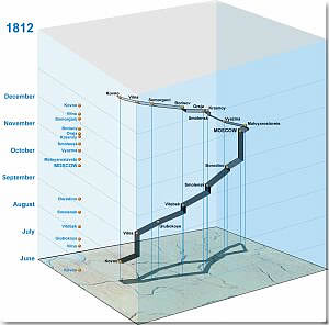
I searched online to see if something similar had been implemented in a different genealogy software before, looking for other ideas to add to my concept. I finally came across Dominik Köhle’s bachelor’s thesis , which implements a “space-time cube” inspired by a geovisualization study by Menno-Jan Kraak:
I decided that a working implementation for Gramps would definitely be a useful visualization. So I continued working on it sporadically over the past few months. I finally reached a point where the tool provided me the insights into my database that I was looking for. I decided to clean up the UI a bit and publish some screenshots to see if others are interested in this concept too and to maybe gather more ideas.
Here, you can see the SpaceTimeCube with Luella Jacques Martel’s data, including the birth events of her children with birth relationships and her marriage:
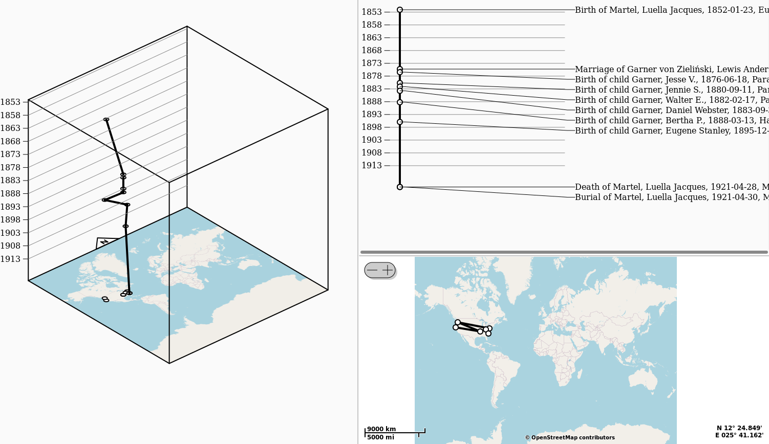
You can select a map section for the cube using the map in the lower right:

Here is a screenshot with additional lines to make the points easier to locate:
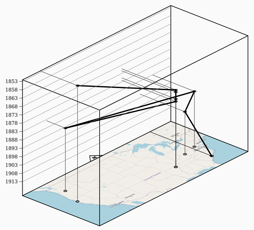
This is the cube visualizing the ancestors of Lewis Anderson Garner von Zieliński:

It looks a bit messy on static screenshots, but when you rotate the cube, you get a better 3D impression, and it’s much easier to grasp what is shown.
Added later:
I managed to record a video:
https://files.catbox.moe/hwv2v0.webm
Please let me know if you know of a better way to embed videos here.
Unfortunately, there aren’t many places with coordinates in the example tree. I added coordinates from Wikipedia to a few places to obtain the data for the screenshots. Also, the places of people’s events seem to be chosen randomly. When visualizing the ancestors of Allen Carl Warner from the example tree, hundreds of crisscrossing lines are displayed.
As you can see in the screenshots, the base of the cube/cuboid is a normal map. The height above the map corresponds to the time of the events. The cube can be tilted to view it from above or from the side. It can also be rotated around the vertical axis, which allows the user to view the cube from any direction.
I decided to use a cube/cuboid, which limits the extent of the map, rather than using an infinite map for the following reasons:
- An infinite map would require more resources when zooming, tilting or rotating the cube. The size of the map on the “ground” would be much larger than necessary. Using fewer map details in the background would require custom tiling. Using a screenshot from an invisible map widget (which is what the view is currently doing), would not work.
- Fading the map in the background would also require fading the lines/data, which would likely require more resources when rotating the cube because all the gradients would have to be recalculated repeatedly.
- It also improves clarity. When a lot of data is being visualized and you select a map section, you do so to focus on your selection. You don’t want to see all the other data in the background.
- Hiding data outside the cube can also improve performance.
My implementation doesn’t use perspective. Implementing perspective would likely complicate the transformations without providing significant benefits. Since I’m using GooCanvas, everything 3D-related (transformations, layering, etc.) is implemented in the addon using GooCanvas features. I didn’t want to use Python packages that aren’t shipped with Gramps installers so that anyone can use the addon once it’s published.
I added two visualizations next to the 3D cube for better orientation. The map in the lower right shows all the places and allows for selection the map section to display in the cube. I also added a timeline that displays the events of each person in a separate column. I have two options in mind for the timeline:
- One column for each person/family, enhancing the current timeline with family columns and connect the paths somehow. I’m not sure how cluttered the timeline will be with the added connections. Most likely, the order of the people/families needs to be optimized for clarity. Reusing or implementing something like TimeNet would be useful.
- One column for each place makes it easy to see when a person moves or stays in the same place. Ideally, users can select the level of place hierarchy to use for this, e.g. each column could represent a country or a populated place etc.
This addon has not yet been released. You cannot try it out yourself right now. (That’s why I decided to use the Ideas category instead of the Development category for this thread.) If the community feedback is positive, I’ll clean up the code and upload it. In any case, please don’t expect the addon to be stable. Consider this addon to be less stable and less tested than FamilyTreeView.
Please note that if there is not clear community feedback to focus on this project, I will continue to focus on FamilyTreeView. There are still important features missing and it appears to be very useful to some users, even in its current non-final stage.
Features I have in mind:
-
In general, improve the appearance and 3D layering.
-
In addition to showing the path of one person (active person or home person) or family (active family), the user should also be able to show one or multiple of the following:
- show paths of ancestors
- show paths of descendents
- show paths of associated people
- show paths based on a person/family filter
There should also be an option to search for individuals and add them and their ancestors/descendants to the view, rather than basing the viewed data on a person or family. I’m not sure if Gramps addon registration interface will require this to be a separate view.
Instead of people and families, it might be useful to show only people or only families in some cases. If this differentiation makes sense and how these options will differ is not yet clear. Perhaps a separate views have to be registered to differentiate between person and family navigation. -
Highlighting of events/places/paths on mouse over in all three visualizations, maybe with a small information popup.
-
Selection (click) of events/places/paths with highlighting in all three visualizations and a information popup.
-
Use different symbols for birth/marriage/death/burrial etc. (maybe similar to those in the TimeLines Map).
-
Options to select which events to show for a person/family. Currently the view assumes that:
- a mother is present at the birth of birth children (This option should only be deactivated if a surrogate is in database.)
- a father is not present at the birth of children (if not explicitly linked to the event)
- mothers and fathers of families are present at some family events such as marriage
-
The user should be able to select which event types to exclude from the view.
-
Add support for different filters: person filters, family filters, place filters, event filters.
-
Currently, the events are connected by straight lines, which in some cases implies slow movement across large distances over decades. It is more realistic to use a horizontal or nearly horizontal line. The user should be able to choose from different visualizations. Alternatively, a heuristic could be implemented to automatically select the most appropriate visualization based on the event types and date types.
-
Visualization of spans and other date types. Currently, only the start of a date is used (i.e. the sort value of a date). It would also require the handling of conflicts without cluttering the view too much, e.g. a residence event with a span date and another event (witness, etc.) within this span.
-
Just as users can select a region on the map to display in the cube, they should also be able to select a time period to visualize in the cube.
-
For the two visualizations on the right: Gray out data in the timeline outside the map selection, as well as gray out data in the map outside the time selection.
-
The view could use coordinates of places higher in the event’s place’s hierarchy, e.g. there are no coordinates specified for the house where a birth event took place, but the village of the house has coordinates.
-
Colors for different people/families, different generations, different ancestral lines, etc.
-
Lines at the base of the cube (projected down from the paths within the cube onto the map in the cube, maybe they can be transparent). The map might become too cluttered if a lot of data is visualized.
-
An option to add arrows to the visualization, especially to the conventional map to show the chronological order of events, i.e. the direction of the path.
Other ideas that may or may not be possible:
- Moving the map up to events for better orientation, like in this interactive example (put your mouse over the triangle on the time axis), maybe using tiles from OpenHistoricalMap based on the event’s date.
- Connecting events using great circles (explanation with images).
- An ideas from Dominik Köhle’s thesis: “event clouds” to represent large-scale and general events (e.g. wars, famines, epidemics etc.), maybe based on the databases of @kmikkel’s addon, extended with geo-coordinated regions, maybe time-dependent regions. This won’t be easy to realize with the custom layering algorithm.
Note: I’m explicitly not listing known bugs, just features.
Ideas for other 3D visualizations:
The third dimension could also be used for:
- Use generations instead of time for the vertical axis
- Visualization of place hierarchy, using the vertical axis for hierarchy level
- Visualization of place name changes in time (all places or places of a specific type)
- Visualization of place hierarchy changes (I’m not yet sure how this chould be visualized)
- 3D histograms for various data, e.g. where the people are born etc.
(I’m not sure if 3D histograms would be much better than simply overlaying a 2D map with colors to create a heat map.) - Once things/heirlooms are added to Gramps, their journey over decades/centuries could also be visualized with the SpaceTimeCube.
I don’t think there’s much benefit to simply adding a third dimension to a typical visualization without providing extra information (e.g. creating a 3D family tree by putting siblings on a 2D plane below the parents in a 3D visualization instead of on a 1D row below the parents in a 2D family tree chart).
What I’m looking for with this thread
Since you’ve read this far, I would greatly appreciate hearing your thoughts on the following:
- Are you interested in the SpaceTimeCube addon? Should I continue developing it and make it available? Which features are you most interested in?
- I’m also looking for other ideas in which three dimensions would make the most sense, so that the effort of implementation would be worthwhile. By this I mean three axes that have an actual meaning (e.g. latitude, longitude and time). Maybe you also have ideas for a 3D visualization that isn’t based on a map?