If the Addons tab was renamed Updates, would this not give the impression that updates would happen for Gramps versions? Yes, a notification that a version update is available would be nice, but it does not exist today.
Very limited as to what can go into the entry description. And the number boxes do not take help text. That is why I attempted to add the help in my earlier attempt.
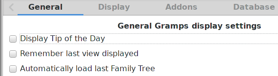
I think the “Automatically load last view displayed” Database tab’s option would be better placed in the General tab just after the “Remember last view displayed” option.
“Automatically load last Family Tree” could then be renamed: “Automatically display last Family Tree” or simpliest “Display last Family Tree”.
The title of the General tab (“General Gramps display settings”) could be simplified to “Gramps startup settings”.
“Satrtup settings” expression seems to me to be quite commonly used in applications to indicate global settings at the application level “user friendly” way.
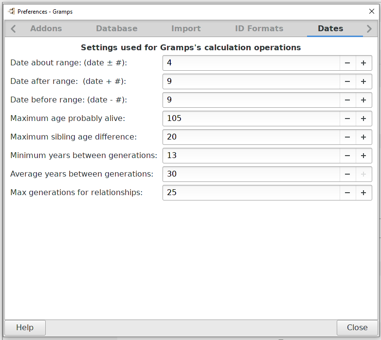
The “Max generations for relationships” option is missing but as I said I don’t know its use (and so its scope). And so I don’t know where to put this.
I am not convinced by the addition of new tabs.
Initially anyway.
There are already so many of them and it makes navigation a bit tedious, we should try to avoid adding more.
It would first be necessary to replace the puzzle pieces in the correct existing boxes and then to estimate whether or not to create new boxes.
I thought about moving the “Automatically display last Family Tree” to the General tab. How about putting it in both!
I think it would be best to leave the description as is, its description is not ambiguous.
The existing title is General Gramps settings. I added “display” to differentiate it with all the other settings especially after I originally tried to add all display settings together.
This was moved to the Dates tab (I hate that name) putting it together with the setting to tell Gramps what about <date> means. What it does is tell Gramps how far out to calculate relationships. Change it to “5” and then see what is displayed in the status bar following your grandfathers back.
Maybe I can get it placed in the Display tab with the Status Bar option.
I too resisted the urge to add more Tabs. But if one of the goals is to only have similar options on each tab, where do Import options fit?
Part of the original “mess” of the Preference tabs (General and Display) was that they became catchalls.
One thing to think about, which order would you place the tabs? At its smallest size (a design consideration) I am seeing 5 tabs when Preferences is launched. Which 5 tabs should we see first?
Will you be able to re-target your new layout Preferences Help button to a different landing page?
We will probably need to backlink to the original layout for awhile. This would allow translators to do a quick 1st pass that just re-targets links to the 5.1 section that already a translated description of the option.
But one of the thing the previous Preferences layout lacks is different landing pages for each Tab. This would help the Wiki layout. The current page is overwhelming.
But seriously, who has a screen that small? Time to move on. That’s an absurd constraint to maintain in 2020 That’s smaller than XGA.
However, on my Mac the prefs window is over twice that size at about 1765x1323, which is plenty big for icons across the top. For comparison, the biggest Safari pane is 1548x1024. It has room for more than 10 icons across the top.
EDIT: I just realized that I can resize the Gramps prefs window, and have. Its minimal size is still bigger than 800x600 at 1246x1558 (or so).
Never do that.
The best place is for me in General tab as it’s a startup setting.
“Automatically display last Family Tree” and “Remember last view displayed” are good friends here.
I don’t think “Display last Family Tree” is ambigous if placed in General tab.
“Display” uniformize vocabulary as it is used for other options in this tab.
“Automatically” isn’t necessary as we are in Startup settings.
I understand your logic but.
“General” is redundant in this title as we are in General tab.
Using “Startup settings” enlarge a little the scope of things you can put in this tab.
You then be allowed to add subtitles in it (left aligned) to show sections : “Display” and “Import” (as I said the two import settings should go in General tab too).
Even not sure subtitles are necessary: just separating sections with a blank line should be sufficient as options titles are IMHO clear enough to understand what they do in this tab.
Limits is a bit too close to the concept of Filters and might confuse things.
Other features that ‘limit’ are:
Max generations for relationships
Age display precision (arguable!)
Warnings tab options (arguable)
(I realize that there are no Preferences related to custom filters. It there were, 2 similar Tab terms would magnifiy contrast. That contrast is missing with only term.)
I like the use of “Remember last” for “Family Tree” and “Last view displayed” as that standarize the vocabulary used and is understandable by Aunt Martha (refering to the last line of https://gramps-project.org/wiki/index.php/UI_style).
I actually came up with Limits indirectly from you.
I entered Range into my word possessor’s (LibreOffice) thesaurus. Limits was one of the options and came closest to the functions on the tab (and being short),
On my walkabout this morning, I thought of “Grandma Died” and other variations. If nothing else, users would check out the tab.
I think General tab could be simply renamed Gramps.
No title is required if the tab contains :
-Display Tip of the Day
-Remember last Family Tree
-Remember last view displayed
-Enable spelling checker
-Show text label before Navigator buttons
-Add default source on GEDCOM import
-Add tag on import
Those one are Gramps application level (and obviously globals at application level).
“Markup for invalid date format” and “Height mutliple suname box” could then go to Display tab.
Those one are globals at database (Family Tree) level and are relative to display.
Oh no! Please, PLEASE, not another redundant instance of a Gramps label!
We have spawned windows ALL OVER that say Gramps more than once in the Titlebars. Plus all the reiterating of Gramplet everywhere.
And some people writing wikipages think we need to append 'for Gramps’s on every page name. (Of course it is for Gramps… it is the Gramps-Project.org wiki!)